William Playfair invented bars, columns, and pies. Over 200 years ago. And drew many timelines.

People still draw the same way. Not always a good idea. For example, William drew this. Above: England buying in Asia. Below: Asia buying in England. People in England are angry.

Exports and imports.
You think: Gap widening, widening, widening, staying wide, slightly closing, closed. Starting in 1755, parallel at last, parallel, parallel. Starting in 1765, widening again, widening, widening. But that’s not the case.

Orange lines by me. Click to enlarge.
You don’t see the hump. Because we see a horizontal parallel line. And ought to be looking vertically. Rather arduous. Our eyes do this only if we know the trick. That’s what he says as well.
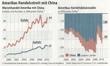
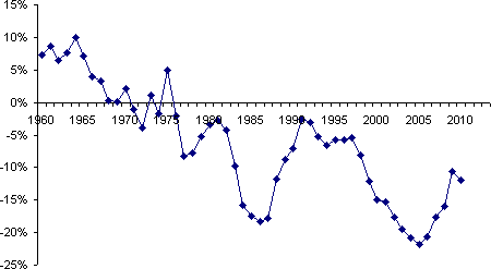
The FAZ newspaper in Germany drew it like William. And we don’t see a lot of the humps. Troubled him as well. The FAZ noticed. And created a second graphic. But it’s not clear there either. Because the red columns start at blue. Instead of at zero.

US trade dispute with China (including Hong Kong). Left: US goods trade with China in billions of dollars. Red = imports, blue = exports. Right: US balance of trade in billions of dollars. Red = China, blue = other countries. Source: FAZ, 2010-09-27, page 13. And his article.
The balance is missing again and you think it shows gaps where there aren’t actually any.

Source: His article.
Don’t resort to William all the time. Just because something’s been around for a long time, doesn’t mean it’s good.

Kommentare
Sie müssten eingeloggt sein um Kommentare zu posten..