Bissantz'Numbers – larger numbers for bigger numbers
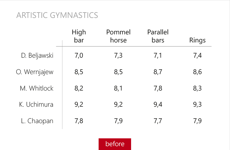
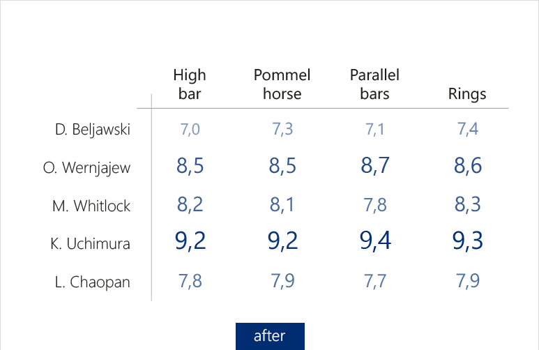
For (business) charts, infographics, statistics, and tables, there is now a new format: the typographically scaled Bissantz’Numbers. The principle is as simple as effective: the larger the value, the greater the number.
This presentation steers the view and explains without any long way round, what the figures have to say.
With our free Add-in for Microsoft Excel, you create typographically scaled numbers in a breath
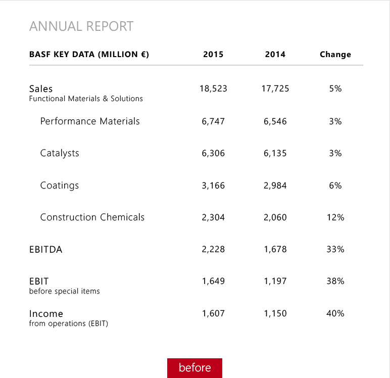
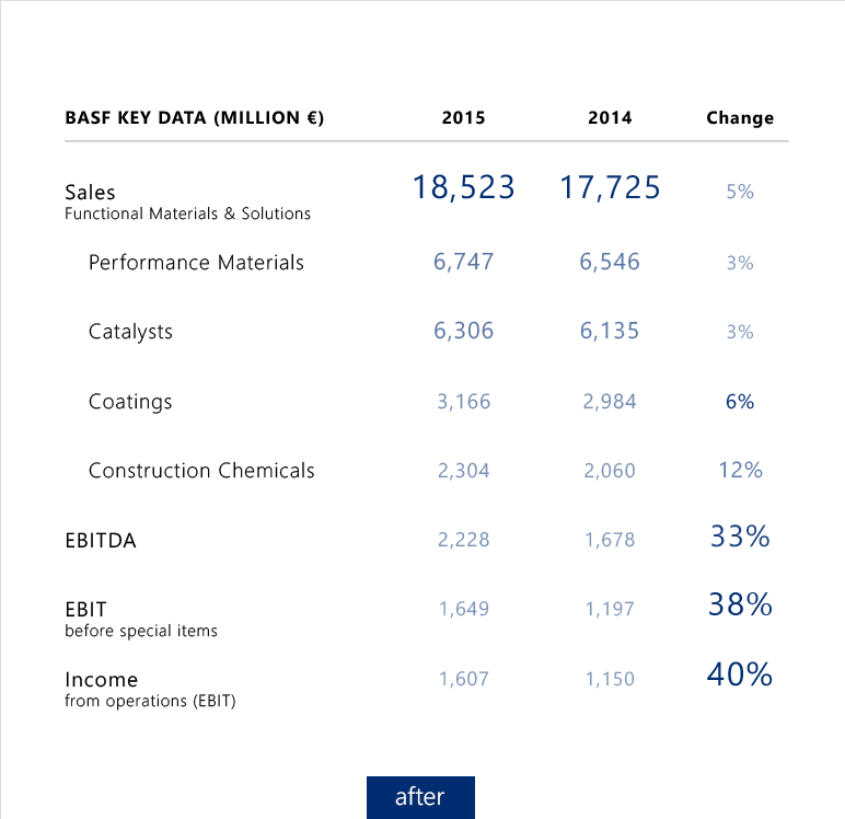
Annual report
Excerpt from the BASF Annual Report for 2015, Functional Materials & Solutions division, which produces, amongst others, catalysts, battery materials, engineering plastics, varnishes, and pastes. When you typographically scale absolute and relative values separately, you can see the disproportionate improvement in earnings, compared to the sales, at first glance.
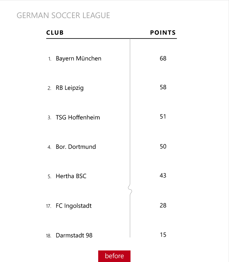
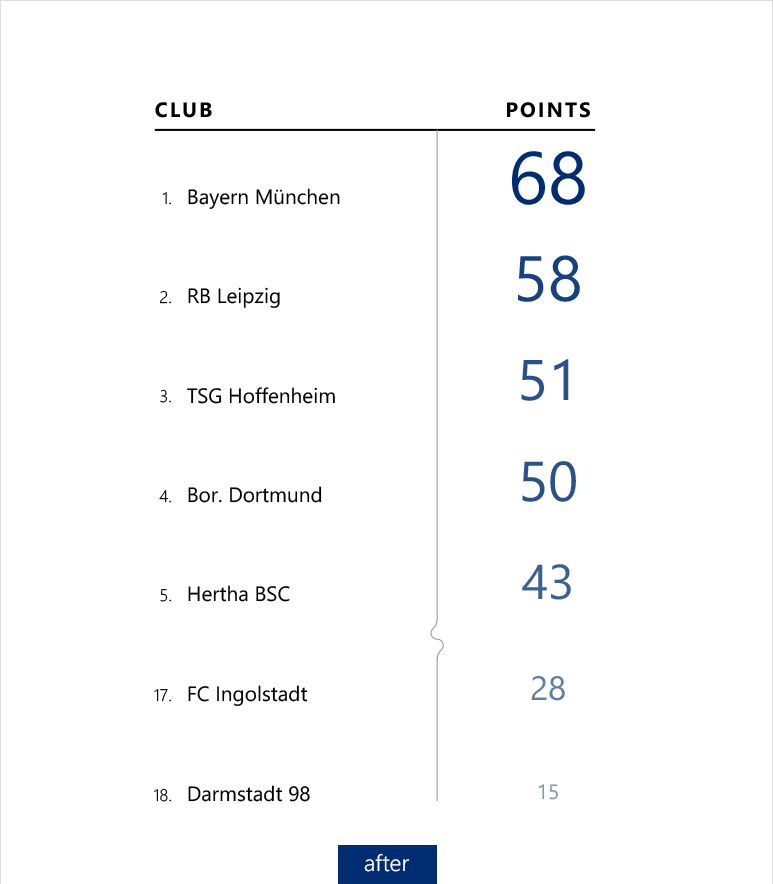
German soccer league
Final standings of the 2016/2017 season of the Bundesliga, Germany‘s premier soccer competition, with the points of the first and the last three places. Even with only six values, the typographical scaling shows its strength: You can experience abstract numbers and their differences.


"Bissantz reinvented the number.”
Dr. Henri Lüdeke, CEO, iwb
"Typographic scaling facilitates the neuronal processing of numbers considerably."
Prof. Dr. Dr. Gerhart Roth, Biology, University of Bremen
"I could not imagine that you are able to experience numbers in an emotional and a rational way."
Thomas Salow, CEO, Coretastics
Medal table
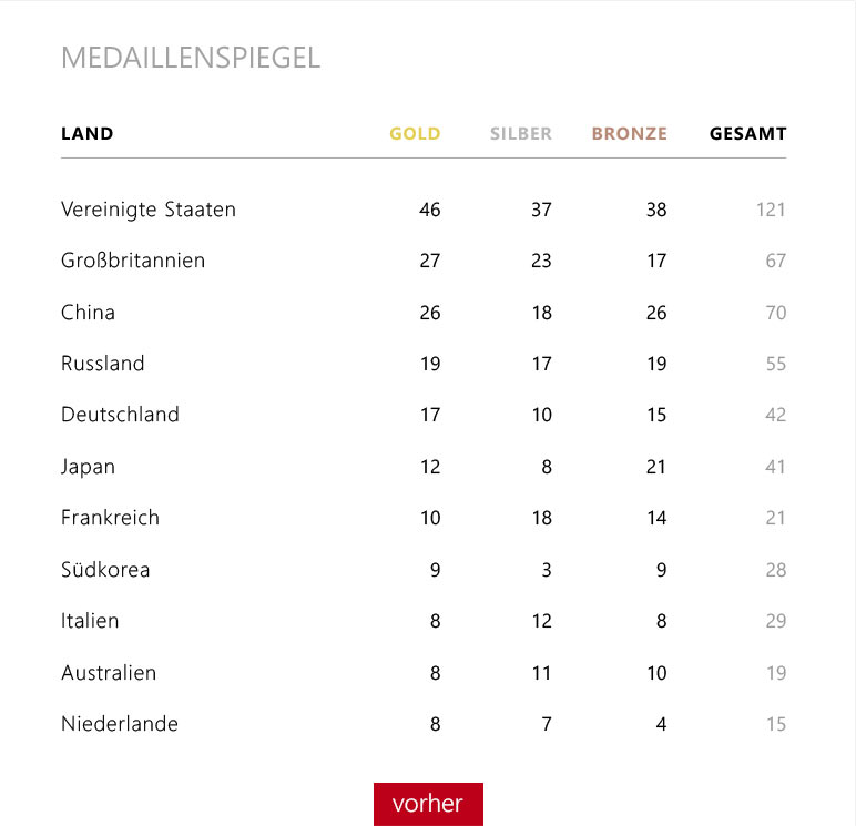
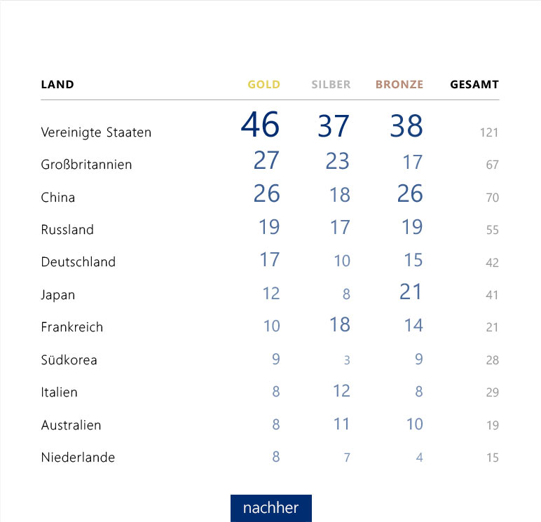
At the 2016 Summer Olympics in Rio de Janeiro, the first in South America, 306 decisions were made in 39 disciplines. The proverbial dominance of the USA, where top-class sport is firmly anchored in the school and university system, is evident on a typographical scale.
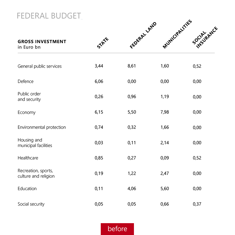
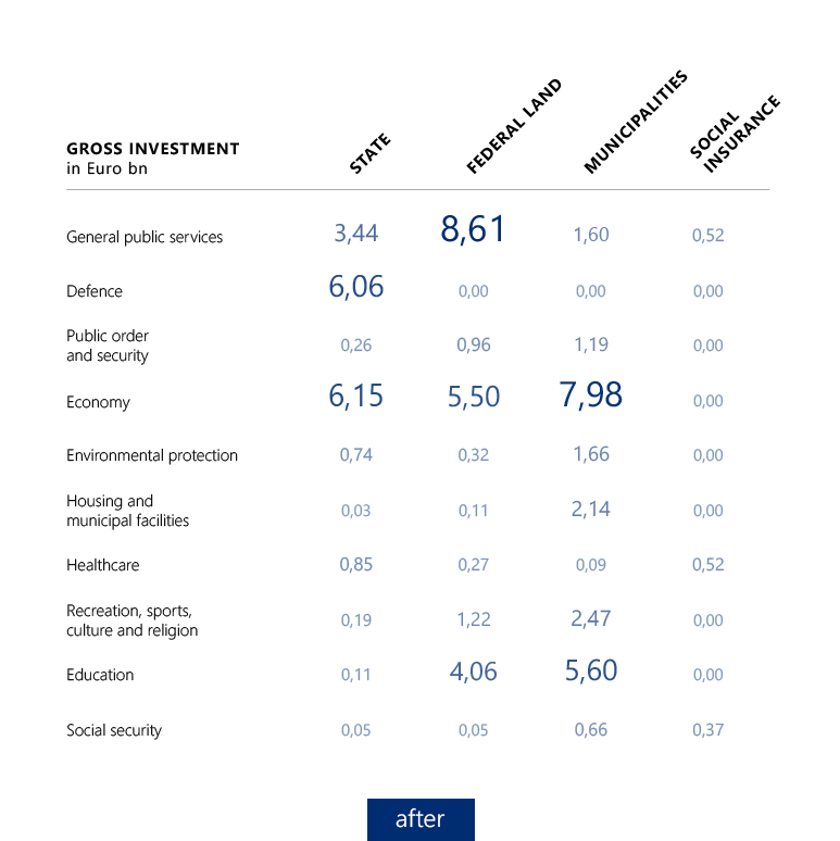
Federal budget
In the federal system of Germany, the federal government, the federal states, and the municipalities share responsibilities and expenditure. The typographical scaling clearly shows the typical responsibilities, e.g. the federal government for the national defense, the federal states for education, and the municipalities for the child day care and the local schools.
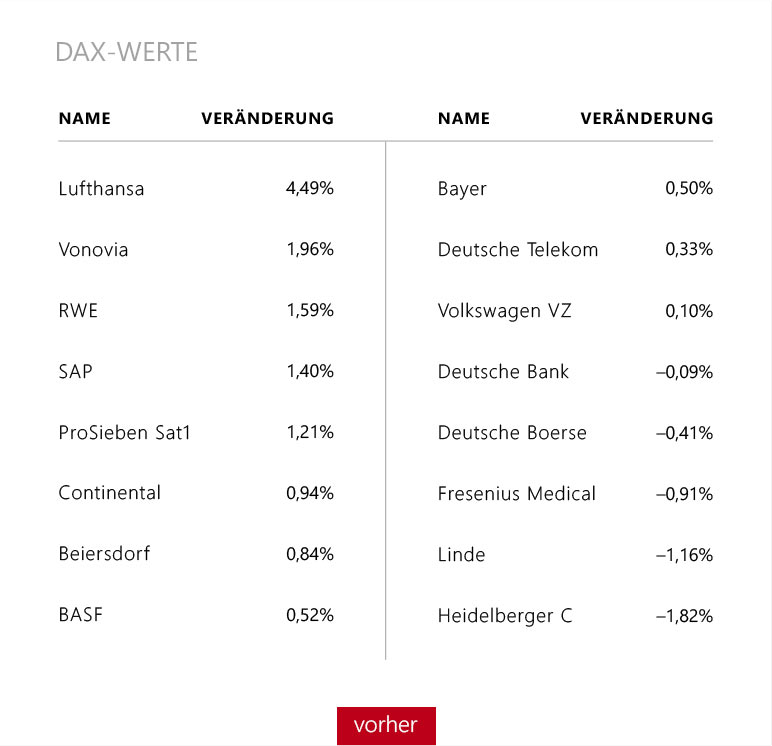
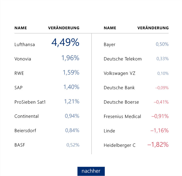
DAX-values
Stock market prices are among the values that change quickly and often and then produce a constantly changing ranking of what is shown. Sometimes the gaps between the ranks are small, sometimes larger, there are clusters or groupings. Typographically scaled figures make every distribution pattern immediately and clearly visible.


Requests for newspaper articles
On websites, sometimes small statistics about the number of “Likes” or requests put a large choice of news in order.
The example shows that even close to text, typographically scaled numbers are most suitable for representing differences.


Medicine
Conventional charts, e.g. line charts, seem to be inevitable when it comes to time series because spotting patterns in a table is considered to be impossible.
As you can see, this has changed with typographically scaled numbers: Now you see the pattern and the number at the same time.
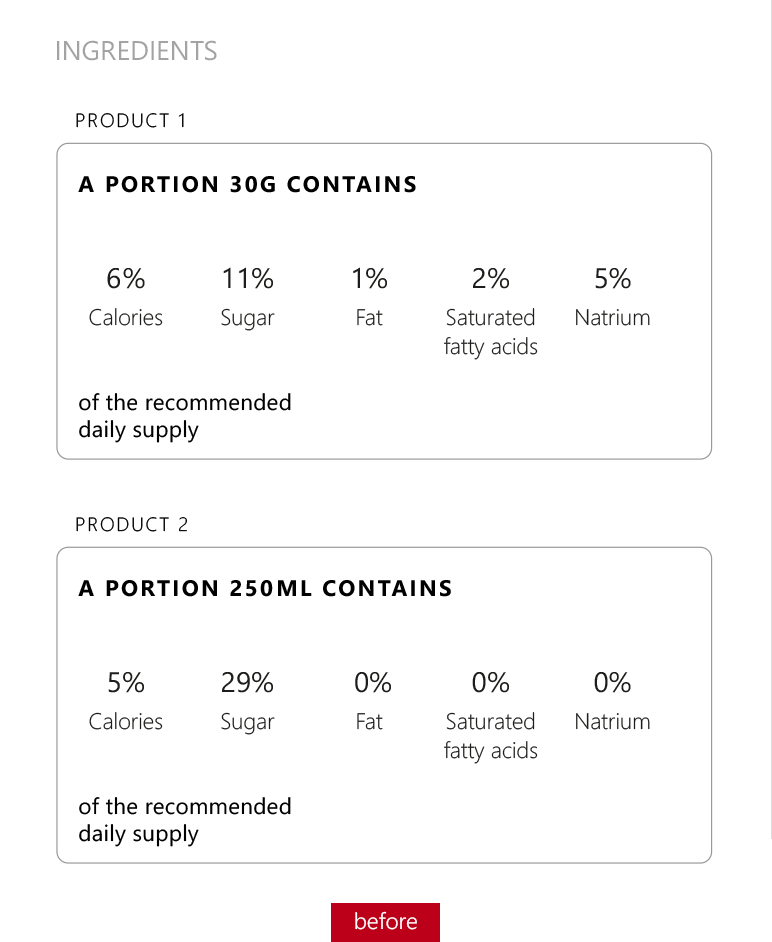
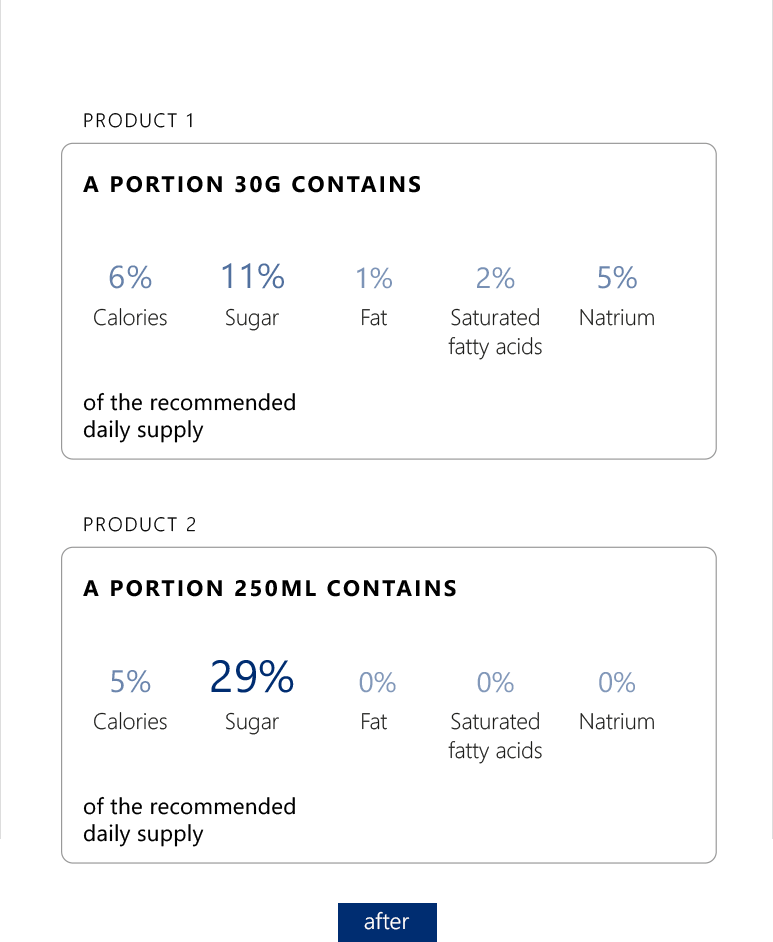
Nutrition Facts
Legal information aims at a greater transparency for the consumer with figures about the ingredients or the composition of a product.
With typographically scaled numbers, this works even better and more direct.
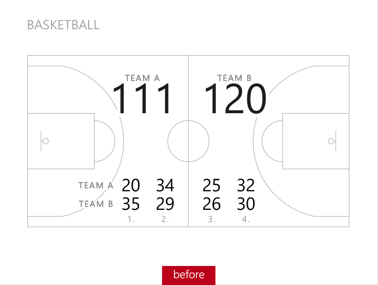
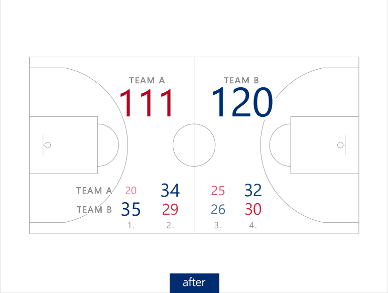
Basketball
The representation of match results seems quite simple. It is about two teams and in soccer also often about few goals.
As the basketball example shows, the typographical scaling accelerates the understanding and makes the differences between the quarters obvious.
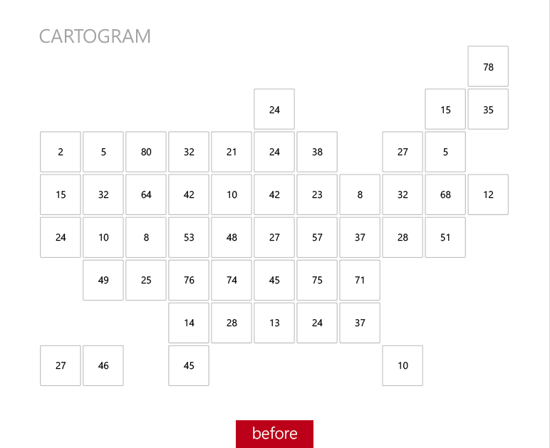
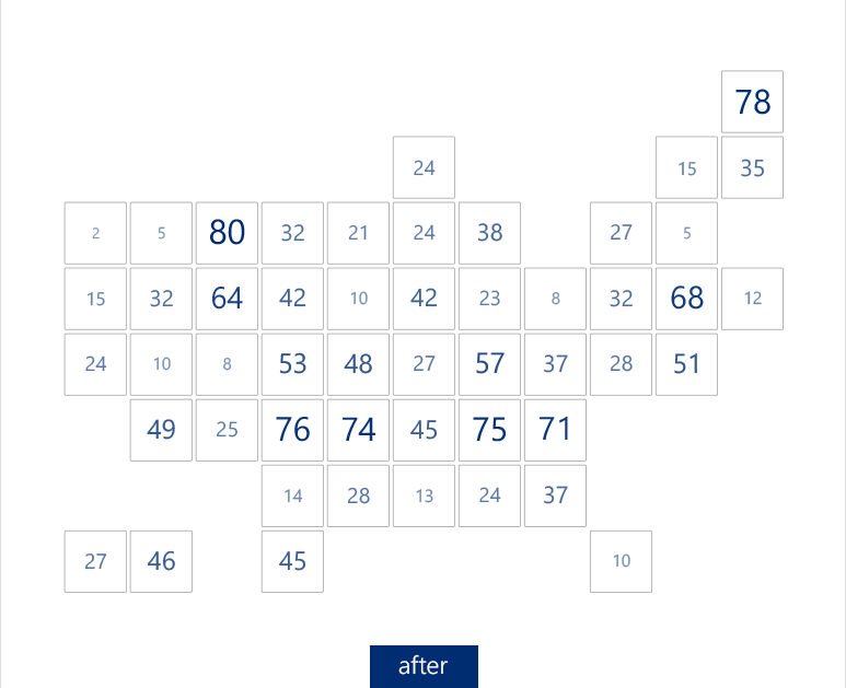
Cartogram
A cartogram avoids distortions that arise when map areas deviate too much from the ratio of the values that you want to visualize by coloring the areas or placing graphical elements and/or values on top of them.
The effect of a cartogram can be increased using the typographical scaling.
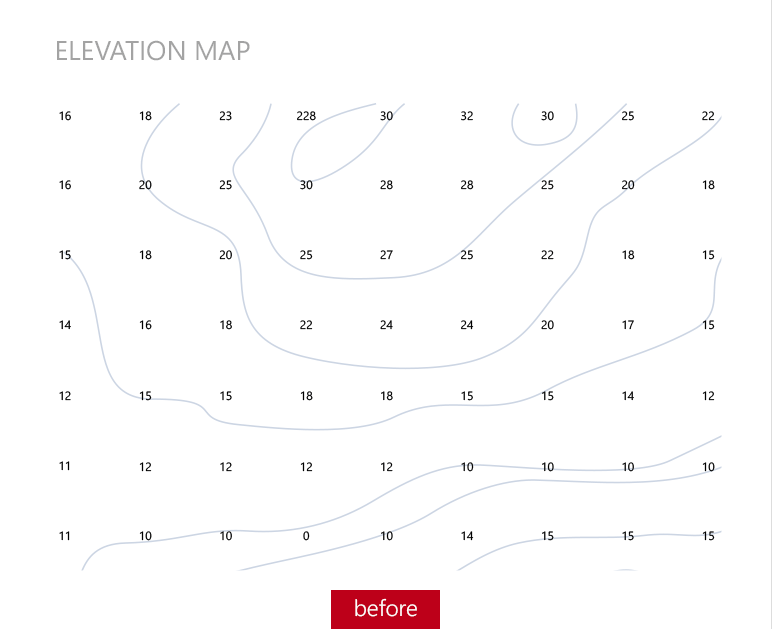
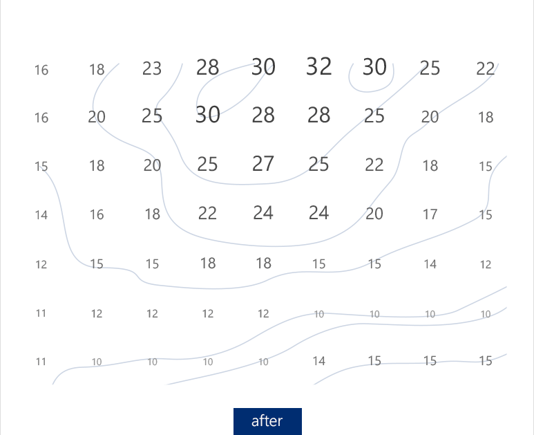
Elevation map
Contour lines are very abstract. It takes a lot of imagination to see hills and valleys in the lines and elevations.
Typographically scaled elevations, however, make the landscape much more apparent.

