Presenting variances and changes appropriately is a true art form that extends well beyond budgeting issues.
When we have to explain changes, presenting variances accurately becomes a real challenge. Bella recently confirmed this with an example illustrating the distribution of votes in the European Union. She showed that the changes in distribution for the individual legislative bills deliver more information than the actual results.
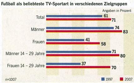
A few weeks back, a German newspaper (Welt am Sonntag, August 5, 2007, p.17) posed the question if the soccer mania that had broken out in Germany during the 2006 World Cup has since ceased. The following chart was included in the article:

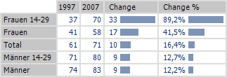
The most interesting piece of information, however, is hidden in this chart. 70% of young women – almost twice as many as ten years ago – rank soccer as their favorite TV sport. Had the chart focused on changes and not just absolute values, this trend would have been much easier to spot:

