We have already discussed the fact that no one in their right mind should steer a company (or a bank in particular!) like an automobile. But what about the other way around? Porsche’s Sport Chrono package has similarities with management reports. That, indeed, could be useful.
Time and time again, I find that automobile analogies serve as an inspiration for designing information in management reports. You just shouldn’t take them too literally, because it would paralyze the whole effect. When they contain little to no information and are transferred 1:1 for management purposes, gauges make reports appear anorexic and are just about as helpful as someone speeding down the wrong lane of the highway!

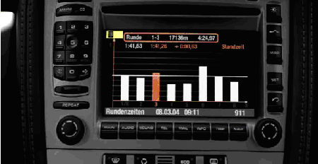
Porsche’s Sport Chrono package provides a graphical assessment of a driver’s round times.
On the other hand, software in general has always fascinated automobile manufacturers. BMW, a pioneer of its time, replaced the reigning design of the hand brake lever with the mouse-like button of the iDrive. The concept is controversial. Some people, including myself, don’t feel that having many well-labeled buttons in a car is annoying. You get used to where they are located and you can tell if they are ‘on’ or ‘off’ with a quick glimpse of the switch. Searching for functions in a menu, however, can be nerve-wracking and, even worse, distracting. Better software – with menu structures that avoid detours – is certainly necessary in this area.
The sports car manufacturer Porsche has recently introduced a feature that is borrowed from management reporting. The company based in Stuttgart, Germany now offers a “Sport Chrono” package for models whose dynamic driving potential is only truly evident (at least occasionally) on closed circuits. Part of the display accompanies the driver while driving his rounds. Afterwards, hecan view a time series showing his individual round times in chronological order as a bar chart.
It’s really unusual from an Information Design standpoint. Many management reports look like cars – and some cars look like management reports!
