I’ve made great process on my book about charts over the summer and autumn. The structure, content, and the text are all finished. Now I am working with Fabian Kragenings, a design professional from Studio F. A. Porsche, on the graphical didactics. His humorous reflections have opened many new perspectives. Strict rules and harsh critique turn into a lightness in places where you probably wouldn’t expect.

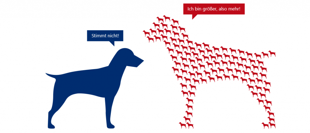
A larger dog is more dog, but not more dogs.
“Symbols for worse”, that’s what our visualization expert Bella realized in her blog. She often covers her face with her paws when she sees pictograms that try to say too much at once or reduce people to common aesthetic symbols for toilets.
I expound on that topic in different sections of my book. One chapter discusses the effects of symbols that try to express a variation of the quantity through variations in size. The human brain isn’t good at processing abstract and concrete thoughts at the same time. Allegories are heavy, intellectual stuff: It takes a lot of practice to recognize “justice” when looking at a blindfolded woman. Symbols that grow are graphical allegories.
If a circle is supposed to represent the population of a country, we understand that circle means number and a larger circle stands for a larger number. That is fully acceptable. Pioneers such as A. W. F. Crome or William Playfair made a great contribution to modern graphics when they began to utilize geometry for charts.
Nevertheless, if we understand a dog for a dog, what should the larger dog represent? More dog – and not more dogs! Otherwise, both sides of the brain hurt if you try to understand it.
Fabian has expressed this in a beautiful presentation. It entices a quick look and awards the slow, intensive gaze, but the reader is happy to overlook that. This presentation says: When we look at the large dog, we don’t just see a larger hound. We see an old dog, because the same dog can only grow and not be divided into parts. Keep that in mind with a weary grin on your face the next time you have to tolerate an infographic that is more decorative than informative …
