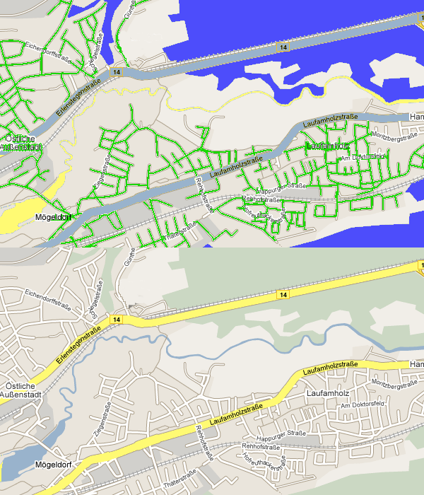
Rolf had a great idea: A map is easy to understand, because rivers are blue and forest is green. It took a while before everyone acknowledged that.

Maps are understood, if they adhere to the common notation
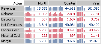
In business reporting one day values, currencies, periods and variances are graphed this way and that way the other day. Rolf insists that months are less wide than quarters and quarters are less wide than years.

If such a notation is used consistently, graphical elements not only illustrate proportions but reveal additional content at a glance. This is a milestone in advancing communication between controllers and managers.
Speaking of color: For the Chinese red is a sign of good luck, while in the West it is a sign of danger. But that’s a different story.
