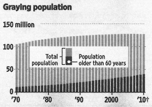
Standard & Poor’s gives Japan bad marks. AA- instead of AA. Japan spends more than it earns. And it is too old. That’s what this diagram in the Journal wants to show.

Quelle: Source: Wall Street Journal Europe, 2011-01-28, page 15.
Count the pixels. The older population grows three times higher. The total population just 20 percent. Even so both series look equally steep. Or flat. Because: Comparing two developments over time is hard. On different levels even harder. We’ve known that for a long time. It applies to proportions, too.
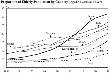
Here we can understand what S&P meant. Because: This diagram shows the proportion only. In comparison to other proportions. And not to itself.

Quelle: Statistics Bureau of Japan (Hrsg.), The Statistical Handbook of Japan 2010, Chapter 2: Population. Here Sixty-Five-Year-Olds and a longer period. Doesn’t matter.
