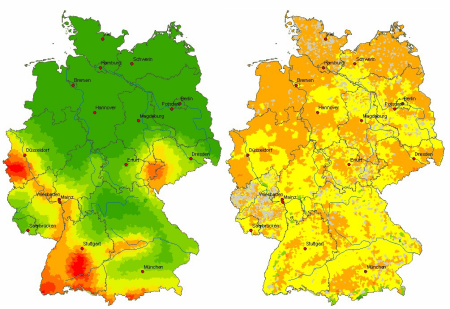
There were nice charts in the German journal “Bild der Wissenschaft” 3/2006. They showed risk maps for Germany. Sadly, they weren’t readable. A little trick and they would have been brilliant. A color gradient from dark red via yellow to dark green doesn’t represent a natural order. Neither for the human eye nor for mine. Green is no better, larger or warmer than yellow and yellow no better than red. If colors with identical intensity are used for lowest and highest values you cannot identify patterns.

Left: Risk of earth quakes in Germany, right: risk of winter storms, source: CEDIM Risk Explorer
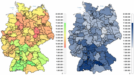
Cognition of colors has to be proportional to displayed values. It’s best with a gray scale. If color is required, different hues of the same color are easily distinguished by the eye. For differentiating positive and negative values a combination of two colors is o.k.

Traffic light colors vs. color hues – geo analysis example from DeltaMaster
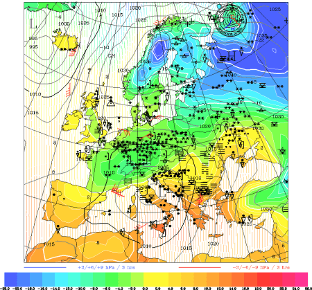
What a pity that most designers of weather charts don’t know that, either. Zero degree Celsius is very blue. Plus one degree Celsius is only a little less blue. But never yellow.

