This one took me a while. Looks harmless. The biggest one on bottom, the smallest one on top. Together they are decreasing. Got it. The strongest drop is Chrysler. The second-strongest Ford. The least drop is GM. Got it wrong. Measure it. Otherwise you don’t get it.
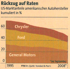
US market share of American automobile manufacturers, cumulated in percent.
Source: Financial Times Deutschland, 2008-11-21, page 8.
I played with that. The smallest one on bottom, the biggest one on top. That lifts Ford and lowers Chrysler.
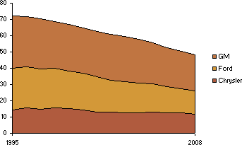
When you put Ford on top, then it really falls.
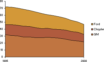
Watch out: The first of the stacked lines is normally what matters. Look what happens if the first line rises and the others fall. I turned the GM data around. No changes for the others. Chrysler also rises now, although it´s falling.
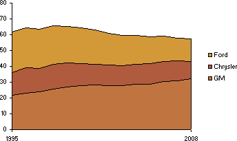
Market share of GM the other way round with data of WardsAuto.com.
Therefore: Beware of areas. Don’t stack lines. Read graphics carefully. By the way: It would have worked like this:
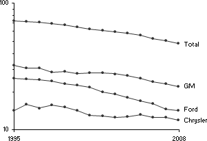
Every line is one manufacturer. For the total amount another line. Everything logarithmic.
