One of my rules for all charts: My rules are not for all charts.
In an issue of the USA Today: How do youth hockey players injure. Very often somehow. And quite often others. Intentionally. A decogram, he would say. First I thought: The chart is not serious. The subject isn’t either. The chart doesn’t want to be serious. It doesn’t have to. Then I pondered: Injuries are not funny.

Source: USA Today, 2010-10-18, page 1.
In the same issue of the USA Today: America has spent a lot of money. And saved accounts and cars. America wants this money back. A serious subject. Shown seriously. Good.

Quelle: USA Today, 2010-10-18, page 7A.
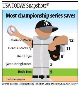
Again in the same issue of the USA Today: a carved baseball player. Also a decogram. Again I thought: The chart is not serious. The subject isn’t it either. The chart doesn’t want to be serious. It doesn’t have to. Then I pondered: carving pictograms of humans? Not so funny.

Source: USA Today, 2010-10-18, page 1B.
Serious has to be serious. Funny may be funny. Taste helps always.
