In our company, people think a lot about how to present figures well. ‘Well’ means that everybody is able to quickly grasp what they mean. That gives us more time to brood over their impact.
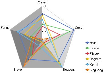
Things become difficult when it comes to radar charts.

The same data is much better off in a graphical table. The most important fact emerges immediately: I am always above average!

Here at the office, they make software that draws these tables automatically. In Excel you would use the Repeat function. That’s quite simple: a vertical bar is repeated as many times as the corresponding data value prescribes. That yields a nice bar inside the cell. You can even label it if you concatenate the value with the “&” character. Here is a sample how that works.
