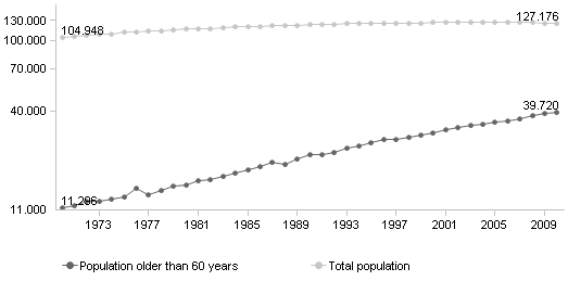
The diagram in my last posting is a pitfall. Do you remember? Japan is too old. Look at it again. If you use columns, you must not use a logarithmic scale. If the values spread widely, you must use a logarithmic scale – and you cannot use columns.

All redesigns: Me.
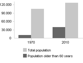
Less years would have been enough. To compare the differences between dark grey and light grey on the left side with dark grey and light grey on the right side the eyes have to jump. Still quite okay here.

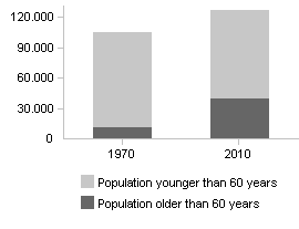
Stacked is okay. Just as well. In this case.

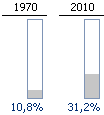
With filled columns you can see the change of the proportion very well. But only that.

The first redesign is my favorite.
