Today it’s getting didactic. I did some cutting.


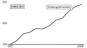
Source: Handelsblatt, April 30th 2009, no. 83, p. 1, redesign by me. Click for original. Graphic displays increase of highway transportation in billions of ton-kilometers (1997 to 2008).
Many will say: left is correctly scaled. They believe: Null value must be shown. Regardless of line or column – never cut.
But: The null value is not sea level. On the right the full space is utilized to display changes. That’s important, often. All other scales more or less steepen the slope. They show more or less details. That the variation is bigger than 50%: neither visible on the right nor the left. Better write that down.
Anyway: To cut lines’ feet is not forbidden. Snip snap.
