What else can we gain from all the extra space won through compact charts and information-dense visualization? Insight, of course!
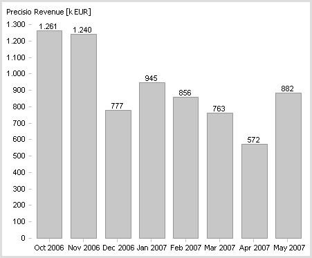
The diagram below is a typical business chart created millions of times each day in finance departments around the world. It’s…acceptable. It doesn’t use unnecessary colors. The values and labels are where they belong. The vertical scale, however, isn’t necessary and the horizontal one could be slightly less redundant.

Nevertheless, it doesn’t say very much. We know that revenues were significantly lower in May than in the strongest months of October and November and that sales slumped more than they flourished. Personally, I think you can convey ‘that much’ information using much less space.
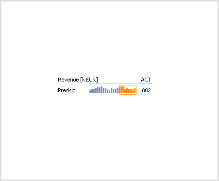
If the chart were smaller, we could view the developments over a longer time frame. And look! Now we can see that these ups and downs follow a regular pattern. Believe it or not: we learn more because the chart is smaller. Why? We understand relationships more easily when we view them within eye’s sight. The human brain was not designed to grasp relationships in information that is absorbed in bits and pieces.

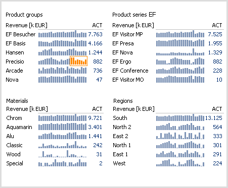
We can then use the extra space to include other comparisons. For example, we can check if the Precisio product line has a similar development pattern as other product lines. Alternatively, we can show these findings in more detail or from a different angle. These are all possible benefits of higher resolution.
While our first chart explained 8 values, the one below visualizes 576. It’s very similar to driving a car: the only thing better than horse power is…more horse power. The only thing better than information density is…more information density.

