Colors make the world bright and happy. They are a pleasure for both our eyes and souls. They grab our attention and help us remember things. The human brain perceives colors separately from form and movement – ultrafast and simultaneously. In financial controlling, however, less is more.
Last Sunday was very rainy so I spent the day at Museum Wiesbaden. Since 2013, the museum has presented its natural history collection in a new concept with the title “Aesthetics of Nature”. I was fascinated, and what I saw even has parallels to our past two postings. The current exhibit in Wiesbaden, namely, centers around color.
Colors captivate the human eye. But should financial controlling be as bright and colorful as the world around us – or is that too much of a good thing?
Colors are fascinating – green, perhaps, the most. Without the green leaves of plants, there would be no life on earth because only green plants contain chlorophyll, which is necessary for photosynthesis. When sunlight hits the water on the ground and carbon dioxide in the air, the plants generate glucose and release oxygen in the air.
Hunters and the hunted camouflage themselves in the colors of their surroundings. Their fur or skin looks like earth, stones, sand, snow, grass, trees, or moss. Stripes and spots lose their contours as the light reflects in lakes, oceans, or forests. But colors do not only camouflage, they also warn if something is prickly, poisonous, or inedible. Contrasts of black with red or yellow are especially common. The venomous coral snake warns with both combinations. On a side note, three quarters of the animals that warn against themselves are harmless. Warning, too, serves the general good more than that of the individual. After all, danger needs to be learned through bad experiences.
The poisonous coral snake is marked with two strong combinations of warning colors: red/black and black/yellow.
The fact that humans can see color is a great evolutionary advantage. As hunters and gatherers, they found the red berries in green bushes and could differentiate ripe fruits from unripe ones. Color also supports the ability to remember things. Colored pictures make a stronger impact than black-and-white ones. This supports orientation and direction finding. One can recognize moving objects more quickly and clearly when they are colored. This aids both the hunter and its prey.
So how do colors support our memory, orientation, and recognition in financial controlling? How can you use them to send the proper warning signals? I believe that the following laws apply:
Colors are wonderful, but two suffice
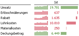
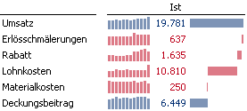
My most important recommendation is to use color sparingly. Black, white, and gray, however, are not enough. Color comes into play in business reports because we have every reason to color business data – for example, things that increase profit should have one color while things that decrease profit should have another. This also eliminates the common problem of correctly interpreting a cost variance with just a glance. Without color, you need to know if costs are marked with a negative or positive algebraic sign. Otherwise, –1,000 can mean both: higher or lower costs.
Black-and-white reports are missing out on important opportunities. Colors convey both signals and emotions.
When it comes to the color selection, two conventions come to mind. Traditionally, business losses are colored red. Green symbolizes something good for many people. I am okay with red, but prefer blue to green.

Should we use the same red and green colors as in traffic lights for business? Not quite.
See for yourself. The contrast of red and green strains your eyes. That has physiological reasons. The color receptors for red and green lie very close to each other while those for red and blue are far apart. This neurobiological fact makes the combination of red and blue easier to read and less susceptible to the limitations associated with red-green visual impairments.

Blue and red for good and bad: Much nicer and easier to read – for physiological reasons.
Red should only signalize trouble – Financial controlling and CI
For the most part of their evolution, humans were members of a tribe and wore its colors with pride. This applies to national flags, family coats of arms, association emblems, logos, and even tattoos. In the meantime, people pick and choose their own clans and even belong to several. A person is a member of a soccer club, fan of a brand, member of a political party, etc. Communication and marketing strategies know that and place a high value on the merits of a common look and feel – both internally and externally – because it demonstrates unity. It’s no wonder that that also rubs off on financial controlling and its reports. There is nothing wrong with that when people do not overdo it and obstruct or caricature the actual purpose of financial controlling in the process. We have already criticized companies such as Vodafone or Sparkasse banks, which print strong profits in red throughout their annual reports simply because the color red is a key element of their corporate image (CI). I think that is ridiculous.
Next time, we will address a few more rules in dealing with colors and explain if and how we can use colors to encode and send signals. For those who can’t wait, we’ll give a preview at CeBIT 2014.


